Hello!
Did you notice we changed the heat map on the home page? If not, you should check it out!!
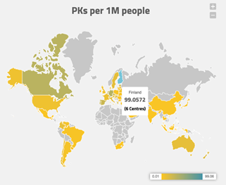
Now when you mouse over a country, three pieces of information will be displayed:
- the name of the country,
- the number of PK profiles per million people within the country,
- the number of centers using WAPPS-Hemo in the country.
The color of the country changes from light yellow (low use per million people) to dark green (which represents a high use per million people). This colour scheme indicates the “intensity” of PK use in the individual country and is a similar indicator to the IU/capita often expressed elsewhere. Yes, these are real PK/capita figures!!
Congratulations to our colleagues in Finland, who are leading the race of personalization of treatment at an astonishing 99 PK/M people!! Second in line is Germany with 38 PK/M people, and third on the podium is Canada with 35PK/M.
Find out how much PK is used in your country by checking out our new heat map!
The WAPPS-Hemo team